Cover Geometry: Selecting Typefaces for Shelving Success
Published May 22, 2025 • By Regina Sterling
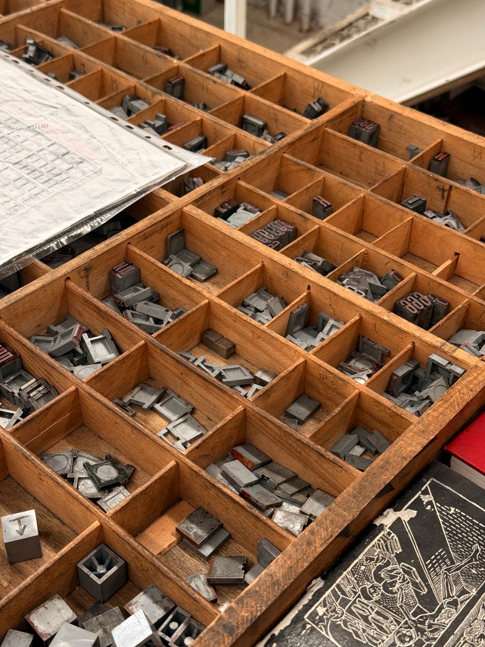
A book cover constitutes the primary threshold of your artistic brand. Long before a reader consumes your introductory prologue paragraph, they digest the visual texture, alignment, and font geometry representing your concept.
Contrast, Hierarchy, and Spine Presence
Successful bookstore layouts require strict contrast. In dark, wooden store formats, high-contrast, warm colors (like terracottas, warm golds, and tactile creams) actively capture tracking attention much quicker than standard, flat blue or gray styles.
Likewise, spine layout design demands meticulous alignment. Because books on physical shelves display spine layouts exclusively, selecting legible, highly prominent vertical serif fonts ensures consumers read titles effortlessly across visual crowd barriers.
"Your book's dust jacket cover must compete simultaneously across international digital spaces and physical shelf display environments."
Our design room facilitates extensive visual prototyping, ensuring that the physical, spatial geometry of your book jacket is optimized for elite luxury aesthetics.
Craft a Masterpiece Appearance
Collaborate with world-class design experts for targeted title design, spine structures, and luxury finish packages.
Get Free Assessment